Click on an item in
the legend to hide it.
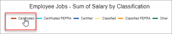
Sample
without Certificated
Click on the same item
in the legend to display it again.
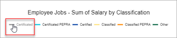
Sample
with Certificated
With the Enhanced Reporting premium tier, you can generate a pie or donut chart from grids, view it in the Chart Output popup, then save it as a PDF or image.
Pie and donut charts are a good way to visualize proportions in your data. Some examples are:
Certified salaries
PO amount by status
Paid invoices by vendor
There are several options in the Output Settings dialog for setting up and displaying the charts including showing slice labels & percentage and aggregating the data by sum or count.
Users can also display saved charts on My Dashboard.
If you try to generate a chart with a very large number of slices, the Chart Output popup will open with the following message — "The chart you tried to generate has too many slices to show the legend and slice labels. Try filtering down the grid or choosing different values for the grouping field and data field to generate a chart with less slices." The example is a chart trying to display the sum of salaries by job name. A more useful chart would be the sum of salaries by job classification because there are many fewer job classifications than job names.
The Grouping Field is the field by which you want to sort the data, and the Data Field is the field containing the data you want to analyze on the chart.
Some examples of grouping and data fields
Chart |
Grid Name |
Grouping Field |
Data Field |
Filter |
Certified salaries |
Employee Jobs |
Classification |
Salary |
Classification = Certified |
PO amount by status |
Purchase Order |
Status |
Order total |
|
Paid invoices by vendor |
Vendor Invoice |
Payment Vendor |
Invoice Total |
Status = Paid |
Title
Chart Title Position & Alignment: Choose where you want the title to be placed on the PDF or image.
Legend
Show Legend: The legend displays the grouping field items and the colors used for them in the chart. The legend is interactive in the chart viewer, allowing you to click on an item to hide and re-display slices.
Chart Legend Position & Alignment: If showing the legend, choose where you want it to be placed on the PDF or image.
Pie
Slices
If you choose to create a chart without slice labels, you can still hover over the slices to view the labels.
Show Slice Labels: Check this box to include the labels for the slices. If you check this box, complete the next two fields.
Pie Labels Position: Select from center, inside end, or outside end. We recommend outside end for readability if the chart will have small slices. Sample center Sample inside end Sample outside end
Pie Labels Alignment: If you've chosen to position the pie labels on the outside end, select from circle or column.
Show Slice Percentage: Check this box to show the percentage of the chart taken by each slice. Choosing this option will display both the percentage and the sum or count. Sample without percentage Sample with percentage
Data
Chart Data Aggregate: Select from sum or count. For example, you'd likely want to use sum if you're charting salaries for different job classifications, whereas you'd likely want to use count if you're charting the FTE of positions for different job classifications. Sample aggregate by sum Sample aggregate by count
Chart Data Sort:
The sort order starts at 12 o'clock on the chart and moves clockwise
around the chart.
Select from:
alphabetical — ascending or descending,
pie slice size — ascending or descending,
pie slice value — negative to positive or positive to negative
When you click on the Display Chart icon the Chart Output popup opens.
If you've chosen to display the legend, while the Chart Output popup is open, you can choose to hide and re-display slices by clicking on an item in the legend.
Click on an item in
the legend to hide it.
Sample
without Certificated
Click on the same item
in the legend to display it again.
Sample
with Certificated
The PDF or image you save will look exactly the way you set it up in the Chart Output popup. Images are saved as .PNG files.
Users can also display saved charts on My Dashboard by selecting that option in the saved grid settings.
If you've chosen to display the legend, you can hide and re-display slices just as in the full size chart.
If there are more than 10 slices, the first 10 slices will be displayed, and the remainder will be grouped under the heading Other.
You can hover over the slices in the chart to view the complete label since the labels may be cut off.
The chart on the dashboard will display the data for the fiscal year in which you're working. If there's no data for that year, the chart will show a square with the caption No Data Available.
Return to Generate Charts from Grids
Return to Output Settings for Grid Reports — Enhanced Reporting - PremiumTier
![]() Version
4.1 © 2022 - Harris School Solutions - All rights reserved
Version
4.1 © 2022 - Harris School Solutions - All rights reserved